, acrylic on canvas, painted both sides and partly reversed, inverted and folded, made shortly before not really trusting anymore the oppositions of colors on a same plane; that is to say the work of art as a real definition, exposing its possibilities from its intrinsic (internal) characteristics; that is to say less expression and more concrete attention: less image, let's say; but i still like this piece, finally.") |
| I've heard it's time to take a look back; that is to say last June, with the fourth version of The island, 306x130cm (120x51"), acrylic on canvas, painted both sides and partly reversed, inverted and folded, made shortly before not really trusting anymore the oppositions of colors on a same plane; that is to say the work of art as a real definition, exposing its possibilities from its intrinsic (internal) characteristics; that is to say less expression and more concrete attention: less image, let's say; but i still like this piece, finally. |


 of the general situation i wish you rejoicing festivities, since after all, if everything has become possible, why not the best? And now the start of a paranoid Christmas Tale. \"I heard last evening that cats have wings; but i don't believe it. Even my friends looked skeptical. It would seem that these are very small wings, almost embryos, that no one had noticed until now. The veterinary surgeon who explained this to us struck me as having a completely balanced mind. I don't recall the scientific details of his argument, but it was very precise. Moreover, he was not trying to convince us, but spoke of the phenomenon as a recent discovery, with the same objectivity as if he had had to relate the rare mode of reproduction of such and such a butterfly.\"") |
| Dear followers colleagues and friends, regardless (ha-ha) of the general situation i wish you rejoicing festivities, since after all, if everything has become possible, why not the best? And now the start of a paranoid Christmas Tale. "I heard last evening that cats have wings; but i don't believe it. Even my friends looked skeptical. It would seem that these are very small wings, almost embryos, that no one had noticed until now. The veterinary surgeon who explained this to us struck me as having a completely balanced mind. I don't recall the scientific details of his argument, but it was very precise. Moreover, he was not trying to convince us, but spoke of the phenomenon as a recent discovery, with the same objectivity as if he had had to relate the rare mode of reproduction of such and such a butterfly." |
, oil on canvas on stretcher, and The paradox, 76x67x30cm (30x26.4x11.8\"), acrylic on canvas, one side white, one side blue, bended. Current work notes, some definitions. Surface, 1: the proper surface of an object designates its limit, its border with the rest of the universe. Surface, 2: External part of a body, which circumscribes the volume occupied by this one. Volume, 1: portion of three-dimensional space occupied by a body; measurement of this space. Volume, 2: Three-dimensional figure, delimited by several adjoining faces. Basically speaking, it looks like miss Surface can't get enough of mister Volume and mister Volume adores miss Surface. Maybe one day they will get puppies, whom they will name Surlume and Volface. By the way about pups toddlers and cubs, i did not digest the passing of my father a few years ago, and probably i will never be able to swallow it, even though we weren't the best of friends. Currently my mother turns ninety-eight more or less; which means it shouldn't take so long. But i don't believe i'll be able to stomach that either. Things last, even (or because) when they don't last. But what i'm saying here isn't so important, do not worry about (:-).") |
| The touch, 100x80x4cm (39x31.5x1.6"), oil on canvas on stretcher, and The paradox, 76x67x30cm (30x26.4x11.8"), acrylic on canvas, one side white, one side blue, bended. Current work notes, some definitions. Surface, 1: the proper surface of an object designates its limit, its border with the rest of the universe. Surface, 2: External part of a body, which circumscribes the volume occupied by this one. Volume, 1: portion of three-dimensional space occupied by a body; measurement of this space. Volume, 2: Three-dimensional figure, delimited by several adjoining faces. Basically speaking, it looks like miss Surface can't get enough of mister Volume and mister Volume adores miss Surface. Maybe one day they will get puppies, whom they will name Surlume and Volface. By the way about pups toddlers and cubs, i did not digest the passing of my father a few years ago, and probably i will never be able to swallow it, even though we weren't the best of friends. Currently my mother turns ninety-eight more or less; which means it shouldn't take so long. But i don't believe i'll be able to stomach that either. Things last, even (or because) when they don't last. But what i'm saying here isn't so important, do not worry about (:-). |


, one green coat + one red coat + one green coat, acrylic on poplar plate, and The fact, 58x37x14cm (23x15x5.5\"), oil on reclaimed folded aluminium. Diet on caption, no twaddle today (:-).") |
| The plane, 250x180cm (98x71"), one green coat + one red coat + one green coat, acrylic on poplar plate, and The fact, 58x37x14cm (23x15x5.5"), oil on reclaimed folded aluminium. Diet on caption, no twaddle today (:-). |


, oil on reversed gessoed canvas on stretcher. I am a little wary of oil paint because sometimes the result becomes too beautiful and goes beyond the intended purpose, taking it elsewhere. Its opulence, its prodigality, its complacency are potentially \"dangerous\". In the range which occupies me, the acrylic, its dryness, its \"poverty\", is probably better suited. Nevertheless, this one is with oil.") |
| The foil, 100x80x4cm (39x31.5x1.6"), oil on reversed gessoed canvas on stretcher. I am a little wary of oil paint because sometimes the result becomes too beautiful and goes beyond the intended purpose, taking it elsewhere. Its opulence, its prodigality, its complacency are potentially "dangerous". In the range which occupies me, the acrylic, its dryness, its "poverty", is probably better suited. Nevertheless, this one is with oil. |


 on the left and The plea on the right, both same size, pigment, acrylic and oil on canvas on wooden painting boards, about presence in painting in its relation to the void, this one being a surface in volume implying depth but not necessarily perspective. But this is probably only an opinion and maintaining and giving expression to an opinion restricts us in that the judgments they contain prevent us from seeing what we might have seen without an opinion, and moreover it restricts the world itself, since opinions generally have no other purpose than to impose themselves on others, i.e. to silence them, and sometimes even before they have been able to form an idea of the situation in question by themselves. Opinion is an attempt to gain undue power. But pretending to be factual is just another opinion. Religious, racial and political beliefs are almost completely foreign to me, because since childhood i have come across so many people who on that basis said so much nonsense that one couldn't take them seriously for a second (apart from taking them seriously for obvious lunatics), which weaned me off the beliefs that people were deliberately, ideologically or unconsciously trying to make me adopt.") |
| A ping game of pong, with The pouch, 40x40x3cm (15.7x15.7x1.8") on the left and The plea on the right, both same size, pigment, acrylic and oil on canvas on wooden painting boards, about presence in painting in its relation to the void, this one being a surface in volume implying depth but not necessarily perspective. But this is probably only an opinion and maintaining and giving expression to an opinion restricts us in that the judgments they contain prevent us from seeing what we might have seen without an opinion, and moreover it restricts the world itself, since opinions generally have no other purpose than to impose themselves on others, i.e. to silence them, and sometimes even before they have been able to form an idea of the situation in question by themselves. Opinion is an attempt to gain undue power. But pretending to be factual is just another opinion. Religious, racial and political beliefs are almost completely foreign to me, because since childhood i have come across so many people who on that basis said so much nonsense that one couldn't take them seriously for a second (apart from taking them seriously for obvious lunatics), which weaned me off the beliefs that people were deliberately, ideologically or unconsciously trying to make me adopt. |


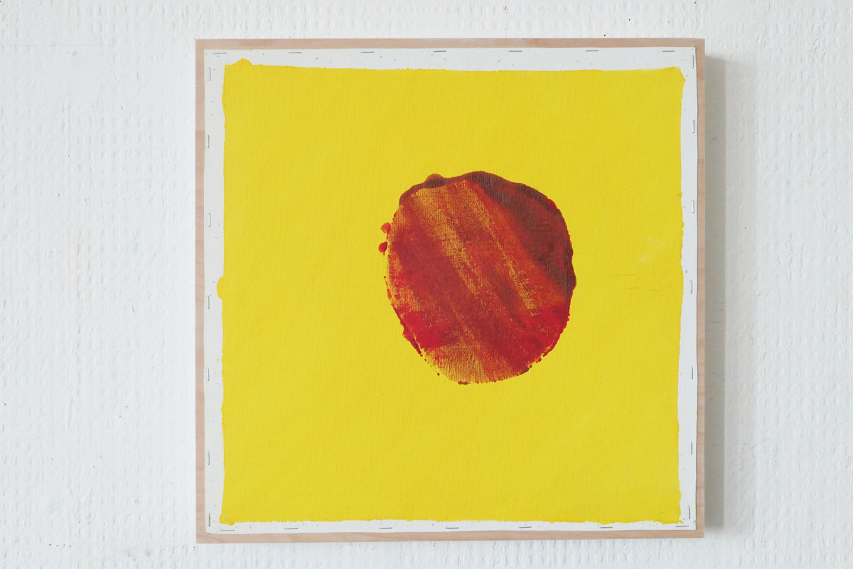
, acrylic on gessoed reversed canvas, and The form, already posted. Same size, same shape, same old brush, same method from right to left in stages starting from the upper right corner. The result depends on the making, not from a pre-established intention (image), but from the application of a fairly simple method. Overtake technique, go beyond skill. On the other hand the color has to be precisely prepared in order to hit properly the hue, density, luminosity and fluidity appropriate to the texture and shade of the canvas itself. Which means that this preparation (choice and qualities of the color) doesn't escape a form of imaginary projection, even if that requires numerous concrete tests. And colors are important as a perceptible manifestation of the existence of light. But if the light did not find a surface where it could crash and bounce, there would be no light and therefore nothing visible. The moon only exists for us because it reflects the light emitted by the sun. It is likely that the technique, which knows no limits because it is based on a language foreign to nature, would be able to make up for this lack by, for example, putting into orbit a procession of large lamps which would abolish the night. It would be another world, but it is conceivable. The whole thing being to know to what extent the production of non-solar light depends or not on the existence of the sun. Any student of physics could explain this to me very well and perhaps convince me, but if one should not speak wrongly and through, one should not either refrain from talking about what we don't know, it is the principle of the hypothesis. Here, it is a mixture of lemon yellow, cadmium yellow and primary yellow broken by adding a bit of soot black powder pigment so that the color doesn't rise in front of the medium, but blends in it, almost belongs to it. No longer arranging the surface using colors, but occupy space with color. The only noticeable difference, perhaps, between these two ones, is that i wasn't wearing glasses for Smell, so as not to be embarrassed by the detail, in order to remain focused on the overall perception of the space.") |
| The smell, 163x163cm (64x64"), acrylic on gessoed reversed canvas, and The form, already posted. Same size, same shape, same old brush, same method from right to left in stages starting from the upper right corner. The result depends on the making, not from a pre-established intention (image), but from the application of a fairly simple method. Overtake technique, go beyond skill. On the other hand the color has to be precisely prepared in order to hit properly the hue, density, luminosity and fluidity appropriate to the texture and shade of the canvas itself. Which means that this preparation (choice and qualities of the color) doesn't escape a form of imaginary projection, even if that requires numerous concrete tests. And colors are important as a perceptible manifestation of the existence of light. But if the light did not find a surface where it could crash and bounce, there would be no light and therefore nothing visible. The moon only exists for us because it reflects the light emitted by the sun. It is likely that the technique, which knows no limits because it is based on a language foreign to nature, would be able to make up for this lack by, for example, putting into orbit a procession of large lamps which would abolish the night. It would be another world, but it is conceivable. The whole thing being to know to what extent the production of non-solar light depends or not on the existence of the sun. Any student of physics could explain this to me very well and perhaps convince me, but if one should not speak wrongly and through, one should not either refrain from talking about what we don't know, it is the principle of the hypothesis. Here, it is a mixture of lemon yellow, cadmium yellow and primary yellow broken by adding a bit of soot black powder pigment so that the color doesn't rise in front of the medium, but blends in it, almost belongs to it. No longer arranging the surface using colors, but occupy space with color. The only noticeable difference, perhaps, between these two ones, is that i wasn't wearing glasses for Smell, so as not to be embarrassed by the detail, in order to remain focused on the overall perception of the space. |


, 163x163cm (64x64\"), acrylic on gessoed reversed canvas from October. Onecolor+one brush+onecanvas+onecoat=onepainting, throwing the composition overboard in order to concentrate on the color and maintaining that one as close as possible to the medium. The organization of the surface is transformed into the occupation of the surface. The paint was applied in one time, not casually or virtuosically, but relatively mundanely. The outcome depends on the hand and of course also happens through the interplay between the color itself and the hue of the substrate, this linked to the relative transparency of the paint. Once the color is found the dice are rolled and it's all win or lose, as obviously the more the field is restricted, the more it widens, it is no longer a question of centimeters, but of millimeters and each decision becomes crucial so that the surface testifies exactly to the necessary information, no more no less, the simpler it is, the more complicated it is since nothing can be hidden or modified, i have one nut and one bolt in the tool box.") |
| The form (and a bluish green test on the left), 163x163cm (64x64"), acrylic on gessoed reversed canvas from October. Onecolor+one brush+onecanvas+onecoat= |


. Actually i intended to show them and some others one after the other but in the end i post only this selection in the timeline 2022-2020. The first one in Emerald green gives a small overview of where the work is headed (thank you Cyrilla Mozenter for your recent attentive and relevant comment.); the blue one is a rather \"slow\" painting, whether in its perception or in its making (around a fortnight every day) and as i also used a lot of pure thinner to remove the color instead of adding it even today it still reeks of turpentine; about the red one, only this: if you don't throw all your cards on one single table you have no chance to lose the game; the black one was done in December 2021 but on re-examining it newly i found the surface ridiculous, dreadful, dull, dead, hateful, gross, hopeless... so i sanded the surface in the wet, gave the whole a good shower (rubbing its dead skin with a horsehair glove, in fact an abrasive dish sponge, what lowered the white of the white, and repainted in oil the parts on either side of the middle with a blend of Paynes gray and Caput mortuum bringing a very slight deep red shade unperceivable in photo of course; the last one wasn't reworked but as i have inadvertently erased it three weeks ago i take this opportunity to fetch it back.") |
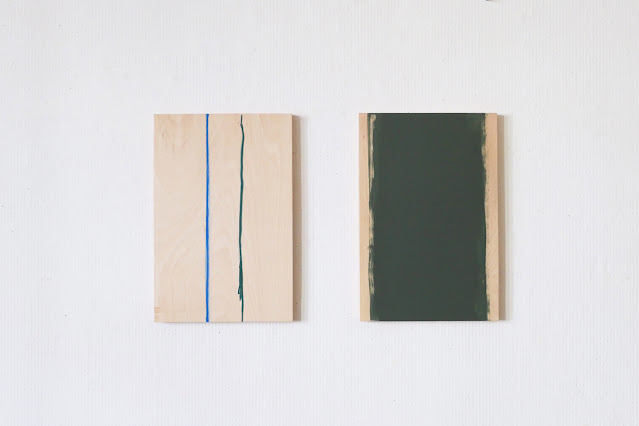
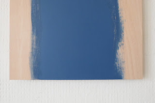
| Five of them left to right: The hint, The partition, The cold, The wait and The signal, each 100x80x4cm (39x31.5x1.6"). Actually i intended to show them and some others one after the other but in the end i post only this selection in the timeline 2022-2020. The first one in Emerald green gives a small overview of where the work is headed (thank you Cyrilla Mozenter for your recent attentive and relevant comment.); the blue one is a rather "slow" painting, whether in its perception or in its making (around a fortnight every day) and as i also used a lot of pure thinner to remove the color instead of adding it even today it still reeks of turpentine; about the red one, only this: if you don't throw all your cards on one single table you have no chance to lose the game; the black one was done in December 2021 but on re-examining it newly i found the surface ridiculous, dreadful, dull, dead, hateful, gross, hopeless... so i sanded the surface in the wet, gave the whole a good shower (rubbing its dead skin with a horsehair glove, in fact an abrasive dish sponge, what lowered the white of the white, and repainted in oil the parts on either side of the middle with a blend of Paynes gray and Caput mortuum bringing a very slight deep red shade unperceivable in photo of course; the last one wasn't reworked but as i have inadvertently erased it three weeks ago i take this opportunity to fetch it back. |


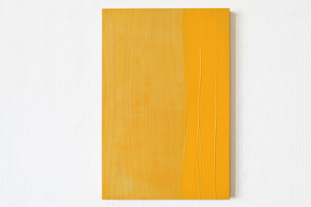
, September 2022. Oil on reverse canvas stained with acrylic. At the beginning, because of the movement, shoulder, arm and hand together, the limit showed a slight but significant curve, but gradually, layer after layer and shift after shift, it gradually got closer to a straight line, which has brought the necessary tension between up and down, left and right. It was no longer a pictorial motif, nor a shape, but color, and its application. It is a rather \"slow\" painting, whether in its perception or in its making (around a fortnight), and as i also used a lot of pure thinner to remove the color instead of adding it, even today it still reeks of turpentine. I'm quite happy to have managed to reduce the composition, the narrativity, the story, the \"reading\", without having to resort to monochrome. The tiny residual impression of curvature of the space, which allows the dialogue between the two parts, comes from the fact that i didn't treat three centimeters at the top and three centimeters at the bottom in the same way as the rest of the fringe. If the whole length had been painted diffusely, it would have been a simple strict straight line and the two sides would oppose each other without communicating.") |
| The partition, 100x80x4cm (39x31.5x1.6"), September 2022. Oil on reverse canvas stained with acrylic. At the beginning, because of the movement, shoulder, arm and hand together, the limit showed a slight but significant curve, but gradually, layer after layer and shift after shift, it gradually got closer to a straight line, which has brought the necessary tension between up and down, left and right. It was no longer a pictorial motif, nor a shape, but color, and its application. It is a rather "slow" painting, whether in its perception or in its making (around a fortnight), and as i also used a lot of pure thinner to remove the color instead of adding it, even today it still reeks of turpentine. I'm quite happy to have managed to reduce the composition, the narrativity, the story, the "reading", without having to resort to monochrome. The tiny residual impression of curvature of the space, which allows the dialogue between the two parts, comes from the fact that i didn't treat three centimeters at the top and three centimeters at the bottom in the same way as the rest of the fringe. If the whole length had been painted diffusely, it would have been a simple strict straight line and the two sides would oppose each other without communicating. |


; and the irritating little yellow thing on the right, called The plea (40x40x3cm = 15.7x15.7x1.8\") definitely didn't want to hop into the trash and clung to the wall. Initially it was an unpainted painting with two canvases, one raw and one prepared, stapled on each side of a stretcher from 2020 or 2019, but as it compelled to be reworked (\"Look at me!\") i embarked on its transformation passing from one surface to another, this time with colors, unhooking and rehooking, cutting the sides and finally stretching it on a wooden panel of the same format as the initial support. Generally i hate to paint the sides of a frame, but this time it was necessary in order to establish a clear relationship between the holder and the white of the canvas, on the other hand to declare more precisely the plane and the planarity of the surface. One can see four thumbnails about the making at the end.") |
| Time machine, 2022-1910. This cardboard could have been titled "The Guitarist" because of its cubist reminiscences, but i won't. Paint and tape on and with inverted, cut out, reversed, upended cardboard (160x100x4cm = 63x39x1.6"); and the irritating little yellow thing on the right, called The plea (40x40x3cm = 15.7x15.7x1.8") definitely didn't want to hop into the trash and clung to the wall. Initially it was an unpainted painting with two canvases, one raw and one prepared, stapled on each side of a stretcher from 2020 or 2019, but as it compelled to be reworked ("Look at me!") i embarked on its transformation passing from one surface to another, this time with colors, unhooking and rehooking, cutting the sides and finally stretching it on a wooden panel of the same format as the initial support. Generally i hate to paint the sides of a frame, but this time it was necessary in order to establish a clear relationship between the holder and the white of the canvas, on the other hand to declare more precisely the plane and the planarity of the surface. One can see four thumbnails about the making at the end. |


. I'm glad i managed to keep the three colors on the same plane, or level, regardless of a pre-existing harmony chord, since personally these three juxtaposed colors make me cringe. But of course the photo is screwing it up as usual... Last week, incidentally hearing that two paintings by Barnett Newman were on display at the Barberini Museum in Potsdam as part of a temporary exhibition, and as we very rarely had the opportunity to see his works in real we hopped on the metro and on a very slow little commuter train. The museums quarter is ugly and the Barberini Museum is ugly too. Actually the museum district, a freshly renovated historic center, looks like a cheap, but expensive, post neoclassical kitschy Italian comedy theater set. (It should be noted here that this kind of environment seems to favor the proliferation of flabbergasted retirees aged at least seventy). I remain convinced that Steven Spielberg must have been called upon for the title of the exhibition: Die Form der Freiheit, The shape of freedom, since i do not see who else could have reached more easily such a standard of sticky propagandist ideology. As one would hope on the basis of such a find, the exhibition is a monstrous tote of abstractions of all kinds in which a she-cat would not find her pups, but no matter, we were there for Newman. Bowing to this aberrant decorative trend that has been in fashion almost everywhere for twenty years at least, the works are hung on a wall painted in a deep colored gray pulling towards violet-parma, which already shows how much the curators love what they claim cherish, and a big perpendicular partition on the left, close to Newman's work and supporting a large blue painting by Helen Frankenthaler, forbids to look at his paintings without having this huge blue thing in the field of vision. But, despite these laudable efforts and the yellowish ambient light in addition, Newman resists this attempted burial. \"Eve\" (1950), \"Adam\" (1951-1952), on loan from the Tate Modern.") |
| Reworked the reworked ones. On wooden painting boards 60x40x3cm (23.6x15.7x1.2"). I'm glad i managed to keep the three colors on the same plane, or level, regardless of a pre-existing harmony chord, since personally these three juxtaposed colors make me cringe. But of course the photo is screwing it up as usual... Last week, incidentally hearing that two paintings by Barnett Newman were on display at the Barberini Museum in Potsdam as part of a temporary exhibition, and as we very rarely had the opportunity to see his works in real we hopped on the metro and on a very slow little commuter train. The museums quarter is ugly and the Barberini Museum is ugly too. Actually the museum district, a freshly renovated historic center, looks like a cheap, but expensive, post neoclassical kitschy Italian comedy theater set. (It should be noted here that this kind of environment seems to favor the proliferation of flabbergasted retirees aged at least seventy). I remain convinced that Steven Spielberg must have been called upon for the title of the exhibition: Die Form der Freiheit, The shape of freedom, since i do not see who else could have reached more easily such a standard of sticky propagandist ideology. As one would hope on the basis of such a find, the exhibition is a monstrous tote of abstractions of all kinds in which a she-cat would not find her pups, but no matter, we were there for Newman. Bowing to this aberrant decorative trend that has been in fashion almost everywhere for twenty years at least, the works are hung on a wall painted in a deep colored gray pulling towards violet-parma, which already shows how much the curators love what they claim cherish, and a big perpendicular partition on the left, close to Newman's work and supporting a large blue painting by Helen Frankenthaler, forbids to look at his paintings without having this huge blue thing in the field of vision. But, despite these laudable efforts and the yellowish ambient light in addition, Newman resists this attempted burial. "Eve" (1950), "Adam" (1951-1952), on loan from the Tate Modern. |


 |
| Antarctic lions wear ice beards, Sahel rabbits lose all their hair, Berlin sparrows grow cumbersome and here are three paintings; two on wooden board and one on canvas stapled on wooden board (before painting). However, after three weeks i found that the middle one had not reached a sufficient standard, then i reworked it partially with filler, resanded it, rewashed it and repainted it. It is stricter now, but welcoming; and as it was too dark to photograph it before leaving Berlin for a while, it will be for another post. About some cruel considerations concerning unverified time-framed statistics. Factually nowadays there are many artists; 99% of these numerous artists are not successful and will never get the possibility to exhibit in decent conditions; which means that almost 100% of the countless works will not have the chance to exist, that is to say to be seen; to say nothing of the material conditions in which these 99% of these plentiful artists survive, 1% of whom maybe produce, have produced or will produce important works that will never have the opportunity to be shown, and therefore will never have existed, since after the death of these oversized 99%, the works will be destroyed or forgotten at the back of a damp cellar by their disgusted heirs, which will destroy them. Pity (:-). |


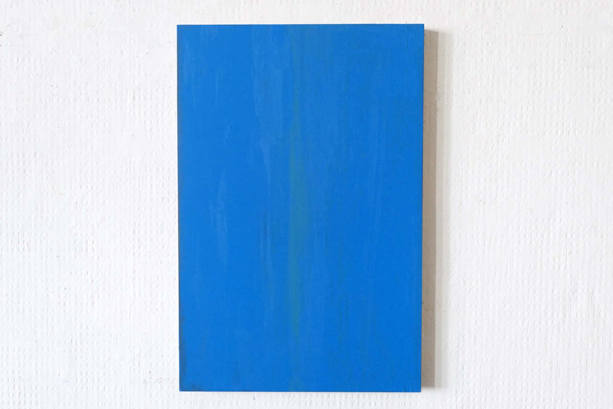
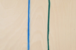
, as such manner that the chromatic radiance (two too big words) adheres to the plane; a plane that is neither the materiality of the support nor the surrounding outside in which the color diffuses, but an intermediate layer that it seems that painting manages to express, to make it, if not visible, perceptible. The color goes now a bit more towards turquoise but my camera stubbornly refuses to take the shade into account.") |
| Today, studio yesterday. I apologize for posting again the blue one but it is different now since it was reworked by sanding and washing and re-sanding and re-washing in order to get some overall stability of color intensity (without losing the central vertical green index), as such manner that the chromatic radiance (two too big words) adheres to the plane; a plane that is neither the materiality of the support nor the surrounding outside in which the color diffuses, but an intermediate layer that it seems that painting manages to express, to make it, if not visible, perceptible. The color goes now a bit more towards turquoise but my camera stubbornly refuses to take the shade into account. |


. By dint of criticizing my paintings just as much as those of others, i have come to this, neither beautiful nor unsightly, which is neither a simple painting nor a reduced painting nor a figurative painting nor an abstract one, programmatically, empirically or dogmatically and which ensues only from leaving aside what seems to me unnecessary (today).") |
The Inherents, started early February 2022, mainly with oil or acrylic paint, on wooden painting board 60x40x3cm (23.6x15.7x1.2"). By dint of criticizing my paintings just as much as those of others, i have come to this, neither beautiful nor unsightly, which is neither a simple painting nor a reduced painting nor a figurative painting nor an abstract one, programmatically, empirically or dogmatically and which ensues only from leaving aside what seems to me unnecessary (today). |


. By dint of criticizing my paintings just as much as those of others, i have come to this, neither beautiful nor unsightly, which is neither a simple painting nor a reduced painting nor a figurative painting nor an abstract one, programmatically, empirically or dogmatically and which ensues only from leaving aside what seems to me unnecessary (today).") |


 |
Two Inherents, with oil sticks and acrylic paint on wooden painting board, 60x40x3cm (23.6x15.7x1.2"). Quote of the day: first and last sentences of the second subparagraph from paragraph 32 in "Analytics of the sublime" out of "Critique of Judgment" by Immanuel Kant (i did my best for the translation, with the help of two translators and a dictionary). 1. To say: "This flower is beautiful" means just as well that it pretends to everyone's satisfaction. - "Sagen: diese Blume ist schön, heißt ebensoviel, als ihren eigenen Anspruch auf jedermanns Wohlgefallen ihr nur nachsagen." 2. For the judgment of taste consists precisely in the fact that it names a thing as beautiful only according to the property according to which it is regulated by our way of apprehend it. - "Denn darin besteht eben das Geschmacksurteil, daß es eine Sache nur nach derjenigen Beschaffenheit schön nennt, in welcher sie sich nach unserer Art sie aufzunehmen richtet." . But, ok, ok, maybe there are more relevant topics today, since now, in addition to the Covid we have to find a way to get rid of the PutTIn (Putin-The-Insane) ... |


 |
Two paintings out of The Inherents with a group photo in addition. All of them mainly with oil or acrylic paint, on wooden painting board (and here, for the right one on the wall, with powdered pigment applied by hand and fixed under a thin layer of acrylic medium), 60x40x3cm (23.6x15.7x1.2"). Now, on the interactive interest of articulated comments for artists. (Because a like is only a signal signaling that you are signaling.) The articulate comment can prove to be very useful for the subsequent development of the work of the artist who receives it. Reciprocally, the fact of having articulated a few words concerning the work of another artist can turn out to be very constructive concerning the evolution of the work of the sender, allowing to articulate himself or herself by boomerang effect. Naturally, the articulated commentary is a statement that always includes an element of criticism. This is its intrinsic interest. Relying on one's own strength in an autarkic way is an illusion paid for dearly. For sure it can cause one side or the other or both small narcissistic injuries sometimes, which may lead some to become shy and to stop leaving comments, or to only write glowing comments which, while pleasant, are just as insignificant as likes. But one have to overcome these small inconveniences to access the benefits. |


 |
Two ones out of The Inherents, with oil (right piece) and acrylic paint on wooden painting board 60x40x3cm (23.6x15.7x1.2"). I'm a little annoyed by the fact that the meeting of these two paintings produces an "beauty effect" which is not sought by the current works, but hey, i'm too lazy to redo other pics on the basis of a less pleasant association, and as an unwelcome tendonitis is making the use of my left arm quite problematic, i accept it as it is, temporarily. And now, it seems that a certain range of artists are very concerned about yellow and blue these days. I was told that it was a sort of political stance in favor of a threatened country. This would tend to establish that a certain number of artists still do not hesitate today to make symbolist use of the colors of a national flag. In any case, it testifies to a genuine commitment to blue and yellow. |


 |
| By zapping from December to February without dwelling on each piece in order to land directly, next week, at The Inherents, a series started recently. I apologize for posting again so quickly, i'm in a bit of a hurry to make up for the unwasted time. |


In Paris:


The unevens:


